First steps
Welcome to react-step-progress-bar!
Here you'll learn to easily create your own progress bars and customize them.
A simple progress bar
In your project create a new file or start a new component from an existing file.
As react-step-progress-bar comes with CSS you'll need to import it at the top of your file.
Code :
import React from "react";
import "react-step-progress-bar/styles.css";
import { ProgressBar } from "react-step-progress-bar";

class ProgressBar extends React.Component {
  render() {
    return (
      <ProgressBar
        percent={75}
        filledBackground="linear-gradient(to right, #fefb72, #f0bb31)"
      />
    );
  }
}
Result :

The <ProgressBar/> component is pretty straight forward to use. The important thing here is the percent prop.
The percent prop will reflect the progression of the bar. It has to be a number between 0 and 100. All other values won't work.
While being simple the <ProgressBar/> component can also be customized.
The filledBackground prop allows you to access to the background property of the filled part of the bar. On the other hand there is an unfilledBackground prop to let you style the background of the unfilled part of the bar. As the property access the CSS background property you can use images, gradients or colors. For more details take a look at the API of the CSS background property.
A progress bar with steps
Here's the killer feature of react-step-progress-bar ! You can add steps to your progress bars. Steps allows you to segment the progression and give visual cues to the user. For more ideas on how to use steps take a look at the examples page.
Code :
import React from "react";
import "react-step-progress-bar/styles.css";
import { ProgressBar, Step } from "react-step-progress-bar";

class StepProgressBar extends React.Component {
  render() {
    return (
      <ProgressBar
        percent={75}
        filledBackground="linear-gradient(to right, #fefb72, #f0bb31)"
      >
        <Step transition="scale">
          {({ accomplished }) => (
            <img
              style={{ filter: `grayscale(${accomplished ? 0 : 80}%)` }}
              width="30"
              src="https://vignette.wikia.nocookie.net/pkmnshuffle/images/9/9d/Pichu.png/revision/latest?cb=20170407222851"
            />
          )}
        </Step>
        <Step transition="scale">
          {({ accomplished }) => (
            <img
              style={{ filter: `grayscale(${accomplished ? 0 : 80}%)` }}
              width="30"
              src="https://vignette.wikia.nocookie.net/pkmnshuffle/images/9/97/Pikachu_%28Smiling%29.png/revision/latest?cb=20170410234508"
            />
          )}
        </Step>
        <Step transition="scale">
          {({ accomplished }) => (
            <img
              style={{ filter: `grayscale(${accomplished ? 0 : 80}%)` }}
              width="30"
              src="https://orig00.deviantart.net/493a/f/2017/095/5/4/raichu_icon_by_pokemonshuffle_icons-db4ryym.png"
            />
          )}
        </Step>
      </ProgressBar>
    );
  }
}
Result :
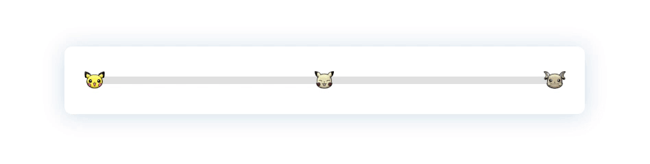
As you can see the code is much longer here. Why ?
Because the <Step/> component focuses only on the functional part. Which means that this component nearly do zero rendering (only a <div/> to encapsulate its children).
That's why the code can look a little verbose. But by only managing the position and the state of the step, the <Step/> component allow you to create highly customizable steps in your progress bars. To learn more on this, read the guide on how to create custom steps.
One of the killer feature of the <Step/> component is that it handles transition. You can use built-ins transition using the transition props. Or you can create your own transition. And yes, there's a guide for that.